
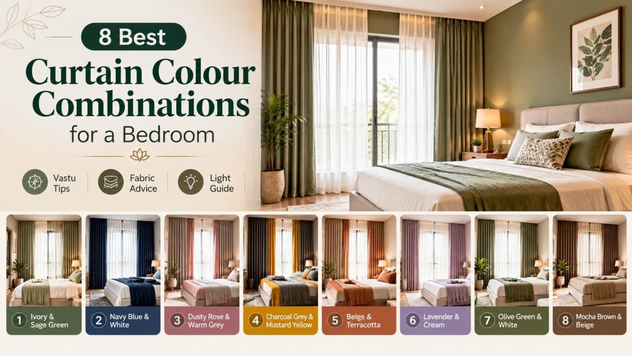
Your eyes land on the windows before anything else in a bedroom. Curtains cover a huge visual area, so their colour sets the mood fast. Most people pick a single shade and hope it works. That often feels flat or mismatched. Smart Curtain Colour Combinations for a Bedroom balance your walls, bedding, and daylight together.
This guide shares eight pairings that work well in Indian homes. You will also find notes on light, Vastu, fabric, and common mistakes.
Three Things to Check Before You Choose
Start with the light, not the swatch. A north-facing room gets cool, bluish light. Warm shades like cream and terracotta balance it well. A south-facing room gets golden light, so cooler shades keep it calm.
Here is a detail most guides skip. Curtain fabric looks two to three shades darker once it hangs. Folds create shadows, and shadows deepen the colour. Pick a swatch slightly lighter than your first instinct.
Next, check the Light Reflectance Value, or LRV. This score runs from 0 for black to 100 for white. Fabrics with a higher LRV bounce daylight back into the room. Lower ones absorb it.
Finally, view the swatch at 8 am and again at 8 pm. Daylight and bulb light change a shade completely. Good Curtain Colour Combinations hold up in both.
Read More: Sheer Curtain Design Ideas For Living Room
A Simple Light Guide by Window Direction
| Window Direction | Light Quality | Shades That Work Best |
|---|---|---|
| North | Cool and soft | Cream, beige, terracotta, mustard |
| South | Warm and strong | Sage, teal, lavender, grey |
| East | Bright in the morning | Ivory, soft green, dusty rose |
| West | Harsh in the evening | Navy, chocolate, charcoal |
Use this table as a starting point. Your own room may behave differently, so always test a swatch.
The 60-30-10 Rule for Curtain Colour Combinations for a Bedroom
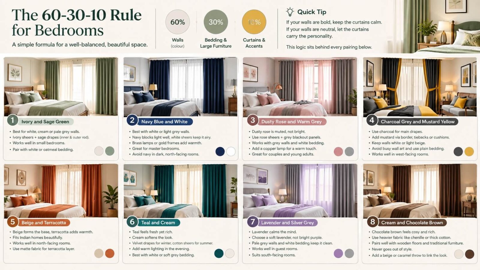
Interior designers often use a simple split. Walls take 60 percent of the colour. Bedding and large furniture take 30 percent. Curtains and accents share the last 10 percent.
Use this rule as a filter. If your walls are bold, keep the curtains calm. If your walls are neutral, let the curtains carry the personality. This logic sits behind every pairing below.
1. Ivory and Sage Green
This pairing feels like a quiet morning. Ivory sheers filter sunlight softly. Sage green drapes add depth without weight.
It suits white, cream, or pale grey walls. Add a wooden bed frame, and the room feels grounded. Cotton and linen bring out the best in both shades.
Among all Curtain Colour Combinations for a Bedroom here, this one is the safest for small bedrooms. Ivory adds brightness. Sage keeps the mood restful.
Pair it with white or oatmeal bedding. Hang the sheers on the inner rod and the sage drapes on the outer rod.
2. Navy Blue and White
Navy and white give a crisp, hotel-style look. Navy drapes block light well, which helps if you sleep late. White sheers keep the daytime look airy.
This works best with white or light grey walls. Brass lamps or gold frames add a warm spark.
Many buyers choose these Curtain Colour Combinations for master bedrooms. The contrast looks sharp but never loud.
Avoid navy in dark, north-facing rooms. It can feel heavy there. West-facing rooms handle it far better.
3. Dusty Rose and Warm Grey
Dusty rose is a muted pink with a grey undertone. It reads soft, not sweet. Warm grey grounds it and keeps the room grown up.
Try rose sheers with grey blackout panels. Pair them with grey walls and white bedding for a calm result.
These Curtain Colour Combinations for a Bedroom suit couples and young adults alike. They also photograph beautifully, which matters if you share your space online.
Add one metallic accent, such as a copper lamp. It lifts the pink without making the room feel girlish.
4. Charcoal Grey and Mustard Yellow
Charcoal is dramatic. Mustard brings energy. Together they create a modern, bold bedroom.
Use charcoal for the main drapes. Add mustard through a thin border, tiebacks, or cushions. Keep walls white or light beige so the pair stands out.
Bold Curtain Colour Combinations like this need restraint elsewhere. Choose plain bedding and skip busy wall art.
This pair works well in west-facing rooms. Strong evening sun softens the charcoal and makes the mustard glow.
5. Beige and Terracotta
This pair feels warm and earthy. Beige forms the base. Terracotta adds a clay-toned glow, especially at sunset.
It fits Indian homes beautifully. The shades echo pottery, mud walls, and traditional courtyards. Pair them with cane furniture or jute rugs.
Warm Curtain Colour Combinations such as this one work best in north-facing rooms. The warmth cancels the cool daylight.
Choose a matte fabric for the terracotta layer. Shiny finishes can make this shade look orange.
6. Teal and Cream
Teal sits between blue and green. It feels fresh yet rich. Cream softens it so the room never turns cold.
Velvet teal drapes look luxurious in winter. Cream cotton sheers keep summers light. You can swap layers by season.
This is one of the Curtain Colour Combinations that rewards good lighting. Add warm bulbs in the evening to bring out the depth.
White or soft grey bedding suits it best. Avoid yellow-toned bedding, since it clashes with teal.
7. Lavender and Silver Grey
Lavender calms the mind. Silver grey adds a polished finish. The pair suits people who want a soothing, slightly dreamy bedroom.
Choose a soft lavender, not a bright purple. Pale grey walls and white bedding keep the look clean.
These Curtain Colour Combinations work well in guest rooms too. They feel welcoming without demanding attention.
South-facing rooms suit this pair. The golden light warms the lavender and stops it from looking cold.
8. Cream and Chocolate Brown
Chocolate brown drapes feel cosy and rich. Cream sheers lift the look and let light in. The pair suits wooden floors and traditional furniture.
Use heavier fabric like chenille or thick cotton for the brown layer. It also helps with insulation in colder months.
Classic Curtain Colour Combinations like this never go out of style. They age well, so you will not need a redo soon.
Add a beige or caramel throw on the bed. It links the curtains to the rest of the room.
Read More: Bedroom Corner Styling Ideas: 6 Smart Ways to Style Them
Quick Comparison Table
This table helps you compare Curtain Colour Combinations at a glance.
| Pairing | Mood | Best Wall Colour | Best For |
|---|---|---|---|
| Ivory and Sage Green | Peaceful | White or pale grey | Small rooms |
| Navy Blue and White | Crisp | White or light grey | Master bedrooms |
| Dusty Rose and Warm Grey | Soft | Grey or off-white | Couples |
| Charcoal and Mustard | Bold | White or beige | Modern homes |
| Beige and Terracotta | Warm | Cream or sand | North-facing rooms |
| Teal and Cream | Fresh | White or soft grey | Seasonal swaps |
| Lavender and Silver Grey | Dreamy | Pale grey | Guest rooms |
| Cream and Chocolate | Cosy | Beige or ivory | Traditional decor |
Vastu Notes for Bedroom Curtain Colours
Vastu Shastra offers simple colour guidance. Many Vastu experts suggest soft shades for bedrooms. Light green, pale blue, cream, and pink are common picks. They say strong red and black can disturb rest.
Direction also matters in this view. Southwest bedrooms suit earthy tones like beige and brown. Northeast rooms suit light, airy shades. East-facing rooms suit greens.
Treat these as helpful guidelines. Comfort still matters most. If you follow Vastu, check how your favourite Curtain Colour Combinations match your bedroom direction.
Many pairings above already qualify as Vastu friendly Curtain Colour Combinations. Ivory with sage, beige with terracotta, and cream with brown suit most directions.
Read More: South East bedroom Vastu
Fabric and Layering Tips
Colour is only half the story. Fabric changes how a colour behaves.
Velvet deepens colour and absorbs light. Linen blends keep a room airy. Cotton sits in the middle. Polyester holds colour longer under strong sun.
Layering helps too. Use sheers for day and blackout panels for night. This gives you two looks from one window. Layered Curtain Colour Combinations also protect furniture and bedding from fading.
Hang the rod four to six inches above the window frame. This makes the ceiling look taller. Let the curtains fall to one inch above the floor, or just kiss it.
Wide curtains look fuller. Buy fabric that measures about two times your window width. Thin, flat panels make even a lovely shade look cheap.
A Small Test We Always Recommend
Tape a large fabric swatch to your window. Leave it there for three days. Look at it in the morning, at noon, and at night.
Notice how your mood changes. Some shades feel calm at dawn but dull after dark. This simple test saves money and regret.
Ask one more question. Does the colour still feel good when the room is messy? Real life is rarely styled, so choose a shade that forgives.
Mistakes to Avoid
Here are some mistakes you must avoid in order to keep your bedroom looking aesthetic.
- Do not match curtains exactly to the wall. The window then disappears, and the room loses depth. Choose a shade two steps lighter or darker.
- Do not ignore the bedding. Curtains should echo at least one colour on the bed.
- Do not buy based on a screen. Online photos shift colour. Order a physical swatch first.
- Do not overload patterns. If your bedding has prints, keep the curtains plain. Even the best Curtain Colour Combinations fail when patterns fight each other.
Final Thoughts
Great bedrooms feel calm, and curtains play a big role. Start with your light. Check your walls. Then pick from the eight pairings above. Remember that Curtain Colour Combinations should suit your routine, not just trends. If you sleep late, choose heavier, darker layers. If you love mornings, pick light, airy ones. Test a swatch, live with it for a day, and trust your eyes. The right pairing will feel like home. Which of these Curtain Colour Combinations will you try first?
Frequently Asked Questions
1. Which colour curtains suit a small bedroom?
Light shades work best. Ivory, cream, pale sage, and soft grey make a small room feel bigger. Pair them with sheers to let daylight in. Avoid heavy dark drapes unless the room gets strong sunlight.
2. Should curtains be lighter or darker than the walls?
Both can work. Lighter curtains keep the room airy. Darker curtains add depth and block light. Avoid an exact match, since the window then fades into the wall.
3. Can I mix patterned and plain curtains in a bedroom?
Yes, but keep it simple. Use one patterned layer and one plain layer. If your bedding already has prints, choose plain curtains to avoid a cluttered look.
4. Which curtain colours help with better sleep?
Soft, cool shades like pale blue, sage green, and lavender feel calming. Pair them with blackout lining to block light. Dark, thick layers also reduce street glare and noise.
